Color Psychology: How Colors Influence Design and Emotions
Colors have a profound impact on how we perceive the world, communicate, and experience emotions. In the realm of design, the power of color goes beyond aesthetics; it plays a critical role in influencing decisions, shaping experiences, and evoking emotions. Understanding the psychology of color enables designers to craft visuals that resonate with audiences and achieve desired outcomes. In this article, we delve into the fascinating world of color psychology, exploring how colors influence design and emotions and offering practical insights for leveraging them effectively in your creative projects.
The Science of Color Psychology
Color psychology is the study of how colors affect human behavior, perception, and emotions. While cultural and personal associations influence color perception, certain psychological effects tend to be universal. For instance, warm colors like red and yellow evoke energy and excitement, while cool colors like blue and green convey calmness and trust.
Why Colors Matter in Design
- First Impressions: Colors are often the first thing people notice in a design, influencing their immediate perception.
- Emotional Connection: Colors trigger subconscious emotions that shape how people feel about a brand, product, or message.
- Decision-Making: Strategic use of color can guide user behavior, from clicking a button to making a purchase.
By understanding the psychological impact of colors, designers can create visuals that communicate more effectively and connect emotionally with their audience.
The Emotional Impact of Colors
Let’s explore how individual colors influence emotions and how they can be applied in design:
1. Red: Energy and Passion
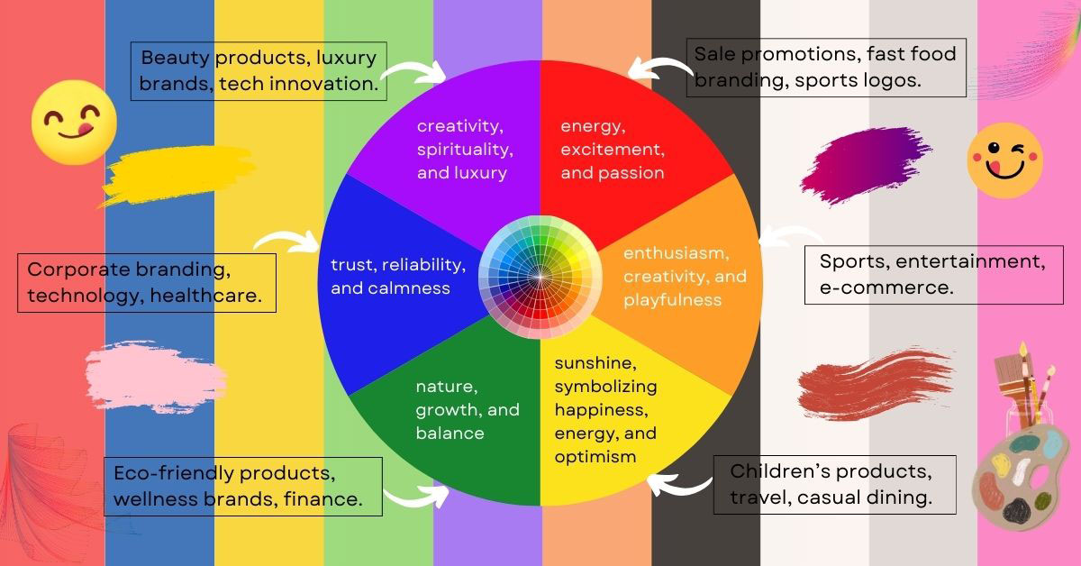
Red is a powerful color associated with energy, excitement, and passion. It grabs attention and stimulates action, making it ideal for calls-to-action (CTAs) and bold statements.
- Emotional Impact: Excitement, urgency, love, power.
- Common Uses in Design: Sale promotions, fast food branding, sports logos.
- Examples: Coca-Cola, YouTube, Target.
2. Blue: Trust and Calmness
Blue conveys trust, reliability, and calmness. It is often used in industries where establishing credibility is crucial, such as finance and healthcare.
- Emotional Impact: Trust, security, professionalism, serenity.
- Common Uses in Design: Corporate branding, technology, healthcare.
- Examples: Facebook, Twitter, IBM.
3. Yellow: Optimism and Warmth
Yellow is the color of sunshine, symbolizing happiness, energy, and optimism. It works well for creating a cheerful and approachable vibe.
- Emotional Impact: Optimism, joy, creativity, friendliness.
- Common Uses in Design: Children’s products, travel, casual dining.
- Examples: McDonald’s, Snapchat, IKEA.
4. Green: Growth and Harmony
Green represents nature, growth, and balance. It is often associated with health, sustainability, and wealth.
- Emotional Impact: Harmony, freshness, rejuvenation, prosperity.
- Common Uses in Design: Eco-friendly products, wellness brands, finance.
- Examples: Starbucks, Whole Foods, Animal Planet.
5. Purple: Creativity and Luxury
Purple is a color of creativity, spirituality, and luxury. It has a regal quality, making it suitable for premium products and imaginative designs.
- Emotional Impact: Sophistication, mystery, inspiration, wealth.
- Common Uses in Design: Beauty products, luxury brands, tech innovation.
- Examples: Cadbury, Yahoo, Hallmark.
6. Orange: Energy and Playfulness
Orange combines the energy of red and the cheerfulness of yellow. It is associated with enthusiasm, creativity, and playfulness.
- Emotional Impact: Adventure, excitement, friendliness, confidence.
- Common Uses in Design: Sports, entertainment, e-commerce.
- Examples: Fanta, Nickelodeon, Amazon.
7. Black: Elegance and Power
Black exudes sophistication, authority, and elegance. It’s often used in high-end branding to create a sense of exclusivity.
- Emotional Impact: Power, luxury, mystery, formality.
- Common Uses in Design: Fashion, luxury products, photography.
- Examples: Chanel, Nike, Apple.
8. White: Simplicity and Purity
White symbolizes cleanliness, simplicity, and purity. It is frequently used to create minimalist and timeless designs.
- Emotional Impact: Clarity, freshness, neutrality, peace.
- Common Uses in Design: Healthcare, technology, minimalist brands.
- Examples: Apple, Adidas, Tesla.
9. Gray: Neutrality and Balance
Gray is a neutral and balanced color that conveys professionalism and sophistication. It’s often used as a background or accent color.
- Emotional Impact: Stability, maturity, modernity, calmness.
- Common Uses in Design: Corporate branding, industrial products, tech.
- Examples: LinkedIn, Mercedes-Benz, The New York Times.
10. Pink: Compassion and Femininity
Pink is often associated with compassion, love, and playfulness. It is versatile and can be used to evoke both fun and sophistication, depending on the shade.
- Emotional Impact: Affection, warmth, youthfulness, femininity.
- Common Uses in Design: Beauty, fashion, children’s products.
- Examples: Barbie, Cosmopolitan, Baskin-Robbins.
Cultural Influences on Color Perception
While certain color associations are universal, cultural differences can significantly influence how colors are perceived. For instance:
- White: Represents purity in Western cultures but is associated with mourning in some Eastern cultures.
- Red: Symbolizes love and passion in many countries but is linked to luck and celebration in China.
- Yellow: Conveys happiness in Western cultures but can signify jealousy in Germany and mourning in Egypt.
Designers should consider their audience’s cultural context to ensure their color choices resonate effectively.
Using Color Psychology in Design
To harness the power of color psychology, follow these best practices:
1. Define Your Goals
What emotion or action do you want to evoke? Choose colors that align with your objectives. For instance, use red for urgency in sales or blue for trust in financial services.
2. Understand Your Audience
Consider the preferences and cultural backgrounds of your target audience. A color that resonates with one group may not have the same impact on another.
3. Create a Balanced Palette
A cohesive color palette ensures harmony and visual appeal. Use tools like Adobe Color, Coolors, or Canva to experiment with combinations.
4. Use Contrast Strategically
Contrast enhances readability and guides user attention. High-contrast colors work well for text and CTAs, while low-contrast colors create subtle backgrounds.
5. Test and Iterate
Experiment with different color combinations and gather feedback to understand how your audience responds. A/B testing is particularly useful for web and app designs.
Case Studies: Effective Use of Color Psychology
1. McDonald’s: Red and Yellow
McDonald’s uses red to stimulate appetite and yellow to convey happiness and energy. This combination is particularly effective for fast food, creating a sense of urgency and joy.
2. Spotify: Green
Spotify’s vibrant green represents freshness, energy, and growth. It aligns with the brand’s mission to provide a dynamic and ever-expanding music experience.
3. Apple: White and Gray
Apple’s minimalist color scheme of white and gray emphasizes simplicity, innovation, and elegance. It reflects the brand’s focus on clean design and user-friendly technology.
Conclusion: The Power of Color in Design
Color psychology is a vital tool for designers, enabling them to create visuals that communicate, engage, and inspire. By understanding the emotional and cultural impact of colors, designers can craft experiences that resonate deeply with their audiences.
Whether you’re designing a logo, website, or product packaging, thoughtful color choices can make all the difference. Experiment, test, and refine your use of color to unlock its full potential in your creative projects.
What colors do you find most impactful in design? Share your thoughts and experiences in the comments below!

